Web design / Consumer web design
Tinder
A small gesture. A clear invitation.
Design challenge
The visitor’s question.
A consumer website has to explain enough to invite a first step without recreating the app. New visitors need a reason to try it, while returning visitors need a fast route back in.
The current public page moves from a short promise into feature discovery, then reassurance and a final app handoff. The study looks at that browsing sequence alongside Madison’s web-design work.
Design decisions
Why these choices.
One message at the first fold
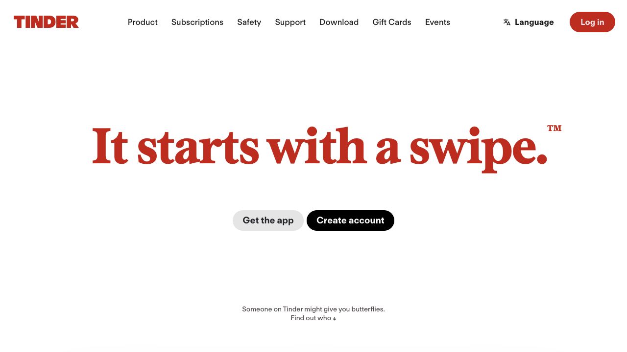
A large headline and one primary action open the page. Visitors can decide whether to explore before reading the features.
Different first steps
Get the app, create an account, and log in address different levels of intent. Returning visitors are not forced through the introductory story.
Tease, then explain
Feature cards introduce an idea before the page expands it. People can scan broadly or stay with a feature that interests them.
Reassurance before the handoff
Safety guidance and common questions appear before the closing download action. Practical concerns become part of the journey rather than a separate dead end.
Visitor journey
Where visitors go next.
- 01Find a reason to explore
- 02Discover a feature
- 03Read safety guidance
- 04Open the app
Motion direction
Use one short transition between ideas, with the headline settled before the next message arrives. Keep app and account actions in place.
Brand applications
Where could this go?
The application collection explores a simple sequence: curiosity, feature discovery, safety, app handoff. Short social cards carry a single idea; a longer mailer has room for questions and a direct route to the public site.