Web design / Performance marketing
Quiver
Two audiences. One wave.
Design challenge
The visitor’s question.
Advertisers and publishers arrive with different goals. Quiver needs a shared introduction that makes sense to both, followed by a clear route into the service each one needs.
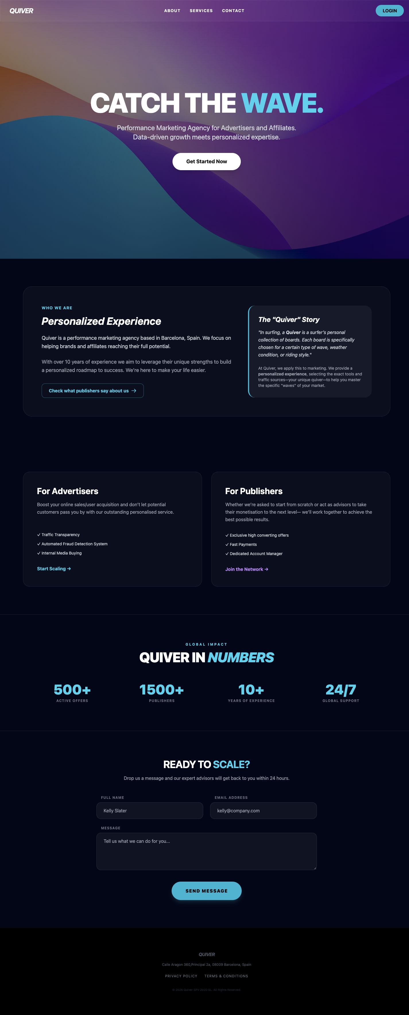
A quiver is a collection of surfboards for different conditions. The name gives Quiver a way to explain choosing a marketing approach. Cyan leads advertisers to their services; purple leads publishers to theirs.
Design decisions
Why these choices.
A memorable opening
A full-height wave composition puts one short message at the center. The page begins with a brand idea before moving into service detail.
A story with a purpose
The About section explains the surfing metaphor alongside the agency introduction. The name becomes part of the offer rather than a word that needs guessing.
Separate routes, shared system
Advertisers and publishers have neighboring service cards. Cyan leads the advertiser path; purple distinguishes the publisher path without making a second website.
Keep the next step close
Login and getting started remain accessible, while anchor navigation lets visitors jump to services or contact. A lower-page form offers another way into the conversation.
Visitor journey
Where visitors go next.
- 01Catch the idea
- 02Choose advertiser or publisher
- 03Get started or get in touch
Motion direction
Subtle hero parallax gives the wave depth. Buttons respond quickly; service-card borders shift color to reinforce the two audience paths. Reduced motion keeps the composition still.
Brand applications
Wave Conditions.
Paired sales decks let each audience follow its own color. A landscape email header and short social sequence introduce a condition, a suitable service, and the next step. Event screens keep the wave idea large and the copy short.