Brand applications / Design study
Tinder
Where could this go?
Color + type
Colors and type.
Surface
#FFF9F5Text
#231F20Accent
#B9342BSupport
#F6E6E1The current reference pairs a large serif headline with a plain interface face. Application studies use Georgia and Arial; these are documented substitutes, not Tinder’s proprietary typefaces.
Use one short transition between ideas, with the headline settled before the next message arrives. Keep app and account actions in place.
Palette roles and values →Artwork + social
Explore the collection.



From screen to paper
Where could this go?
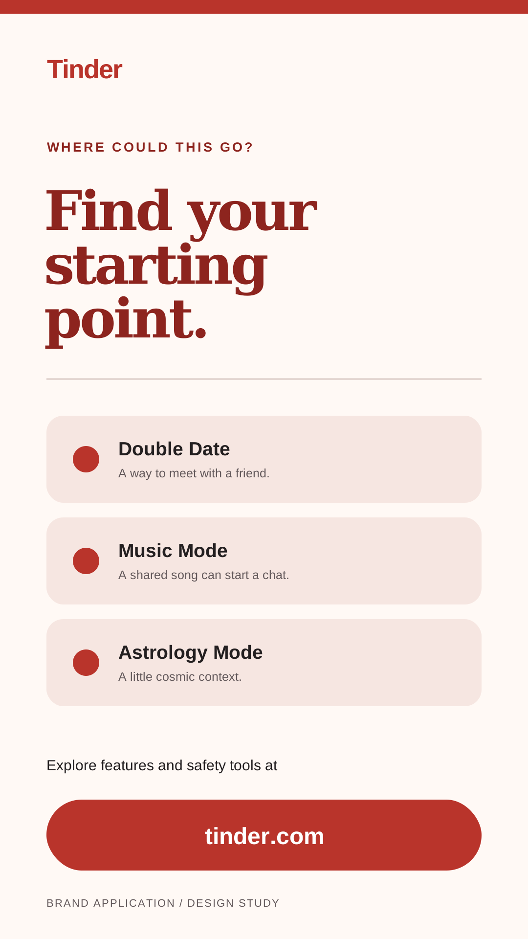
The application collection explores a simple sequence: curiosity, feature discovery, safety, app handoff. Short social cards carry a single idea; a longer mailer has room for questions and a direct route to the public site.
The handoff
Every file, in one place.
14 files, with editable layouts, usage notes and the source inventory.