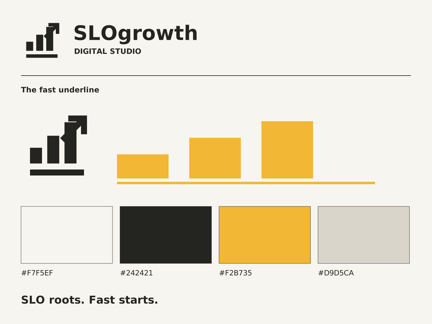
Studio identity · Identity + applications

The fast underline
Three ascending blocks meet an open north-east arrow. The underline ties SLO to forward movement. Keep the full lockup level; the motion belongs in the accent.




Give it room.
Keep clear space of at least one quarter of the symbol width on all sides. Use the horizontal lockup at 240px wide or greater; switch to the symbol below that.
Keep the shape.
No stretching, bevels, shadows or rotation. Use the reversed artwork on dark backgrounds. Leave the symbol intact; decorative applications can extend its graphic device.
Colors and contrast.
These are the core colors used by the studio website. Supporting colors belong in graphics and large surfaces; use ink on paper for body text.
#F7F5EF#242421#F2B735#D9D5CAUse the action color to identify the next step, not every heading. Preserve light and dark hierarchy when a layout becomes one color.
Digital files use sRGB. For print, ask the vendor to convert using their output profile and approve a physical proof.
Type choices.
Display: "Iowan Old Style", "Palatino Linotype", Palatino, Georgia, serif.
Body: "Avenir Next", Avenir, "Segoe UI", system-ui, sans-serif.
SLO roots. Fast starts.
Aa Bb Cc · 0123456789Use sentence case for messages. Reserve capitals for short labels. Start body copy at 16px on screen or 10pt in print, with generous line spacing.
The kit uses system-font stacks and includes no font binaries. Primary lockups contain font-independent outlines. Separate editable-type variants are in the ZIP. Check font substitution before revising those layouts.
Sound like the business.
Local, direct and quick on its feet. Use SLO for place and fast for pace.
Good at your trade. Let’s get you more calls.
Keep out of the copy
Digital transformation, growth hacks, guaranteed leads, jokes that imply we work slowly. Use SLO/slow wordplay sparingly and make the fast-service meaning clear.
Layout rules
Generous paper margins, strong ink headlines and one marigold action per section. Let customer work take the largest image.
Photography direction
Real local work, trucks, shopfronts and people at work. Favor daylight and visible detail over anonymous office scenes.
Social graphics.
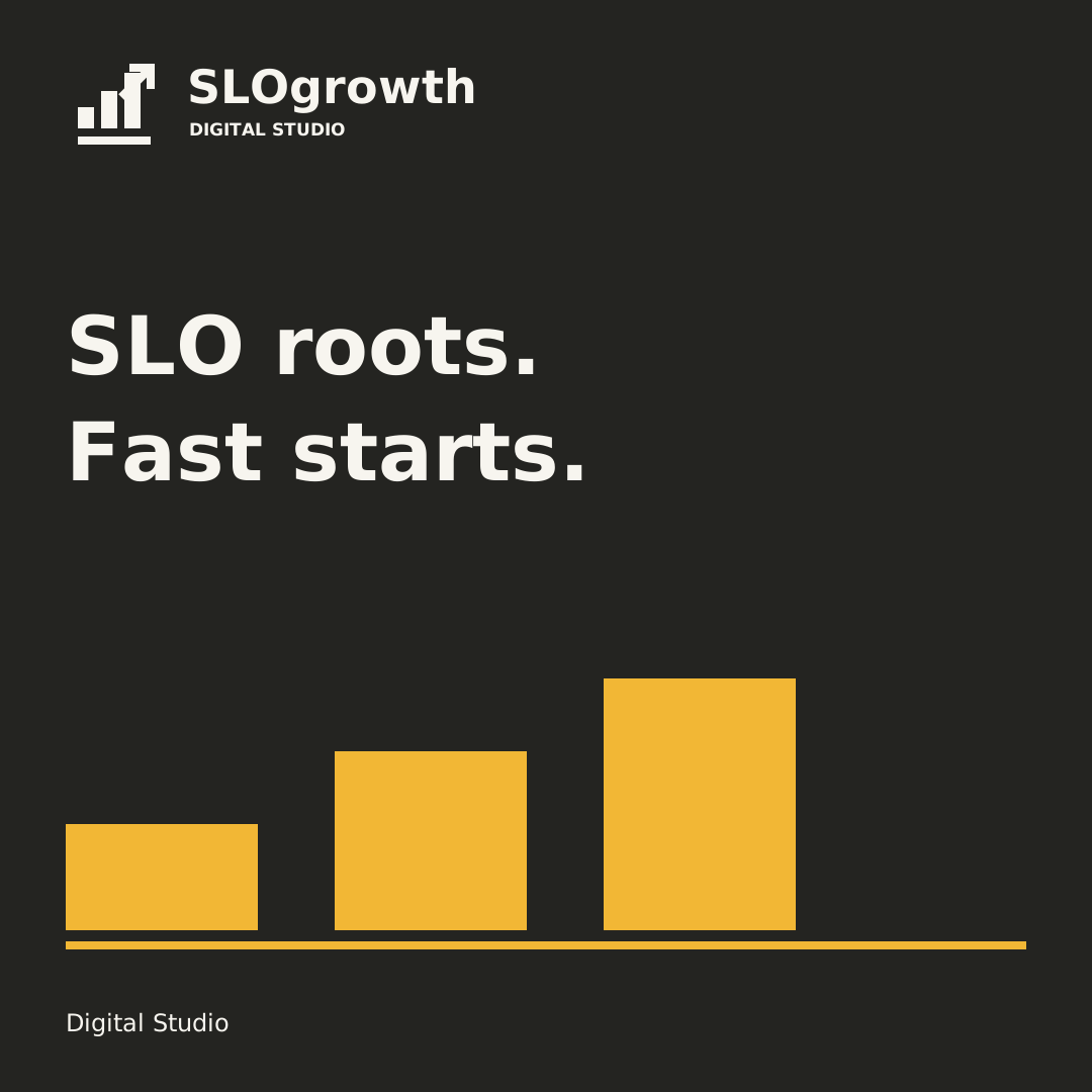
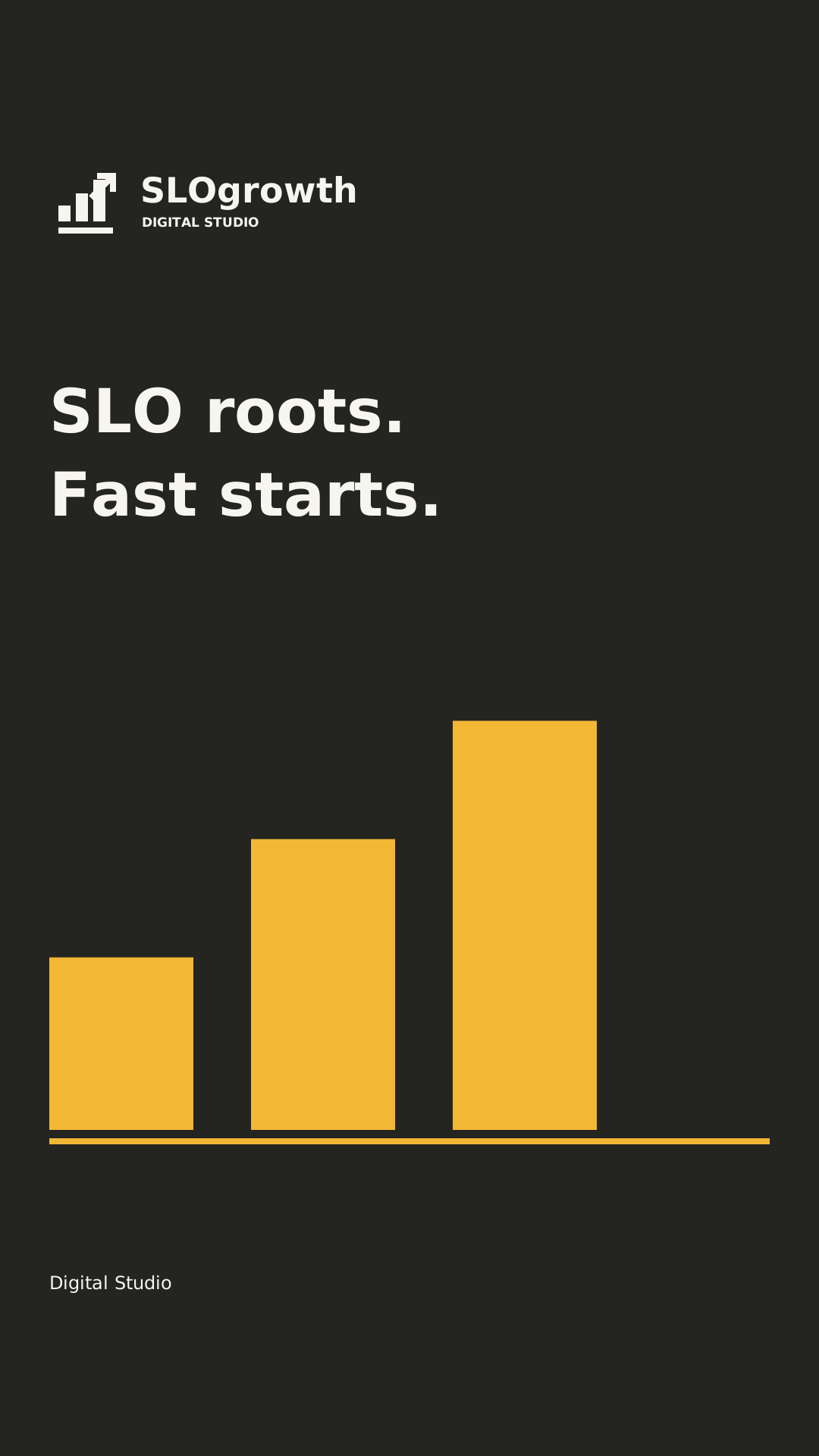
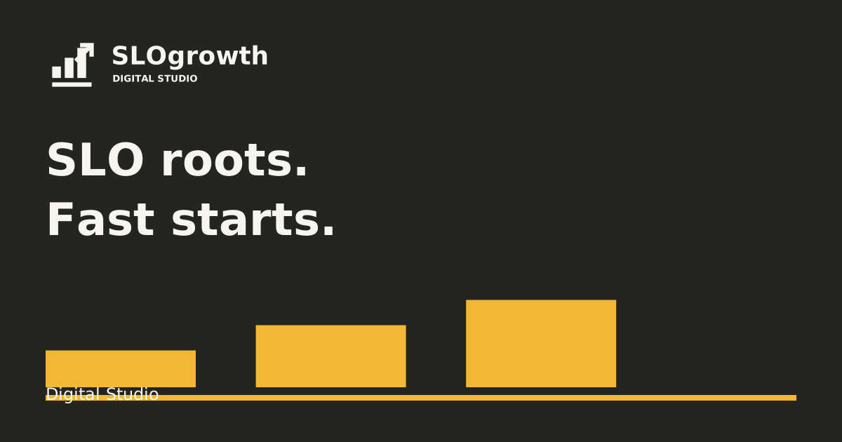
Editable square, story and landscape compositions. Open any asset to inspect it full size, then export an sRGB PNG for your publishing platform.
Print layouts.
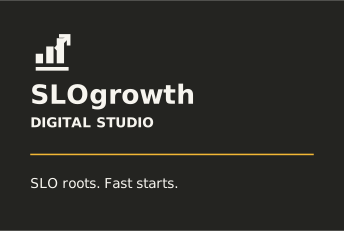
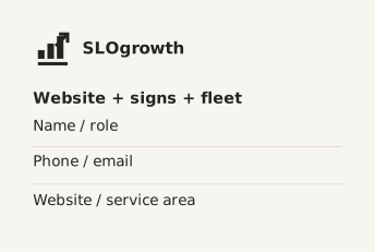
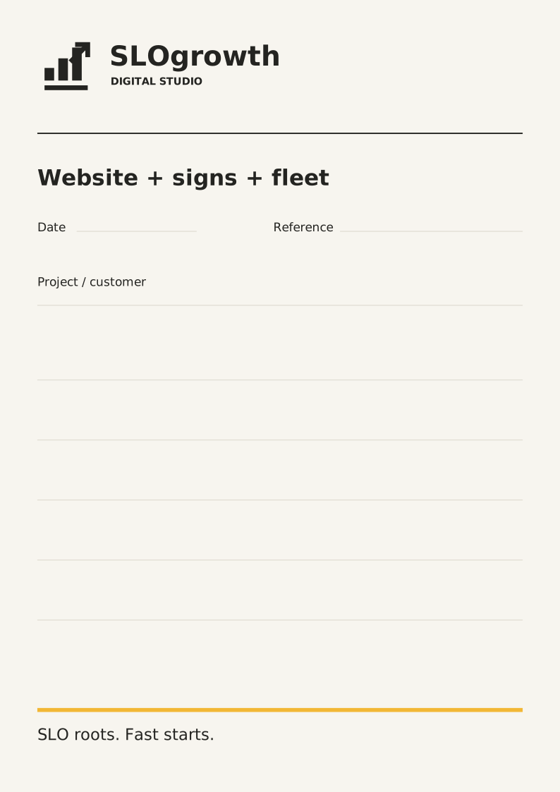
A double-sided card and useful field sheet carry the identity beyond the screen.
Vehicle layouts.
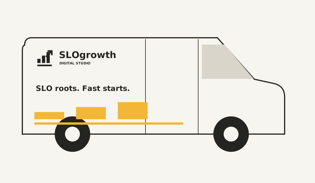
The same mark, message and graphic device on a vehicle. Keep the side recognizable at a glance and the rear simple enough to read when parked.
Motion rules.
A 220ms underline sweep, followed by a quiet 280ms rise. Never delay access to a link or run the chart in a loop.
Keep people in control
Respect reduced motion with a settled static state. Never hide information until it animates, move keyboard focus, hijack scrolling or flash a warning.
Use the same rhythm
Small feedback: 180ms. Section entrance: about 280ms. Ease out cleanly. The longer brand-specific movement happens once, not on a loop.
Download files.
34 files, including business and campaign collections: symbol and lockup variants, an identity sheet, three social layouts, two card faces, a field sheet, two vehicle views, tokens, color values, guide and manifest.