Product website / Made-to-order storage
Stackless
The floor is not a shelf.
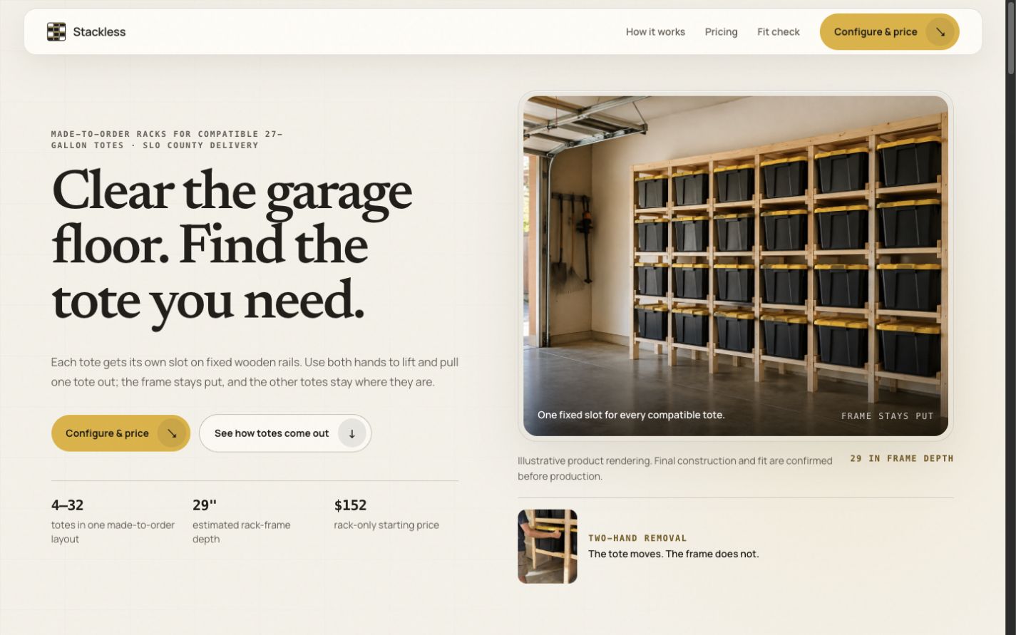
Design challenge
The visitor’s question.
A rack has to earn its space in a garage. Before asking someone to configure one, the website needs to show what changes: a clear floor and access to one tote without unstacking the rest.
Start with the job the product does, then turn configuration into a series of concrete choices. Dimensions and compatibility belong in the buying path, not in a footnote after checkout.
Design decisions
Why these choices.
Show the job first
The opening message pairs floor space with individual tote access. That is more useful than leading with a product name or a list of lumber dimensions.
Make the layout tangible
Rows and columns become a visible rack configuration. Capacity and the estimate update together so the visitor can connect the choice to the result.
Check fit before the build
The next step asks for the tote model, available wall space, and access dimensions. A fit check keeps the conversation specific to the garage.
Explain the mechanics
The product uses stationary rails, not a sliding rack mechanism. Copy and images need to show the tote moving, with the structure staying put.
Visitor journey
Where visitors go next.
- 01See the storage problem
- 02Configure a rack
- 03Request a fit check
Motion direction
The rack stays fixed while a single tote moves in a demonstration. Interface feedback confirms a configuration change without delaying the estimate.
Brand applications
The floor is not a shelf.
A garage-door leave-behind asks what the floor could be used for. A mailer explains tote access and the fit-check process. The billboard keeps only the observation, the brand, and the website.