Client / Housing management
Bestagon Homes
A fair hearing. A clear next step.
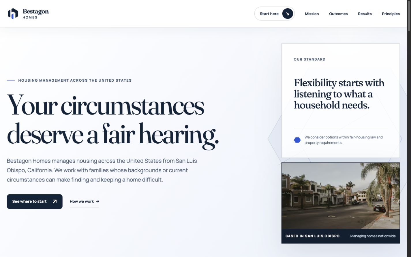
Design challenge
The visitor’s question.
A housing website serves people with very different questions. Someone looking for a home, a current resident, and a property partner should not have to work through the same sales pitch to find help.
Make the first decision about the visitor, not the organization. The Open Shelter identity gives the page a recognizable home, while direct language explains the work and sets expectations before the visitor gets in touch.
Design decisions
Why these choices.
Three doors in
Housing seekers, residents, and partners each get a distinct starting point. The choices use everyday language instead of internal department names.
A useful email handoff
Each path opens an email with a relevant subject. Visitors can explain their situation in their own words without navigating a long intake form.
Expectations before inquiry
The site explains how housing management works and separates illustrative costs from property-specific terms. Questions have a place before the final contact action.
Dignity in the details
The writing addresses people directly. Neighborhood imagery, a restrained palette, and a readable serif give the mission room without turning residents into a marketing device.
Visitor journey
Where visitors go next.
- 01Choose your path
- 02Read what to expect
- 03Start the right conversation
Motion direction
A short, settled reveal follows the three visitor paths. The shelter mark stays intact; it is never split into animated parts.
Brand applications
A clear next step.
A partner handout becomes a three-way guide: looking for housing, already a resident, or exploring a partnership. Social cards carry one path at a time, and a short presentation explains the whole system.