Brand kit / Identity + applications
Quiver
Wave Conditions.
Color + type
Colors and type.
#020617#FFFFFF#22D3EE#C084FCSystem sans-serif. Heavy, tightly spaced headings and an italic text wordmark provide the emphasis; there is no separate proprietary logo font in this collection.
Subtle hero parallax gives the wave depth. Buttons respond quickly; service-card borders shift color to reinforce the two audience paths. Reduced motion keeps the composition still.
Palette roles and values →Artwork + social
Explore the collection.


From screen to paper
Wave Conditions.
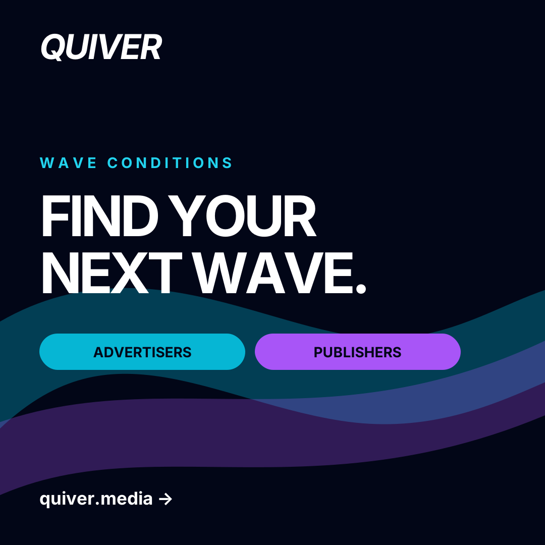
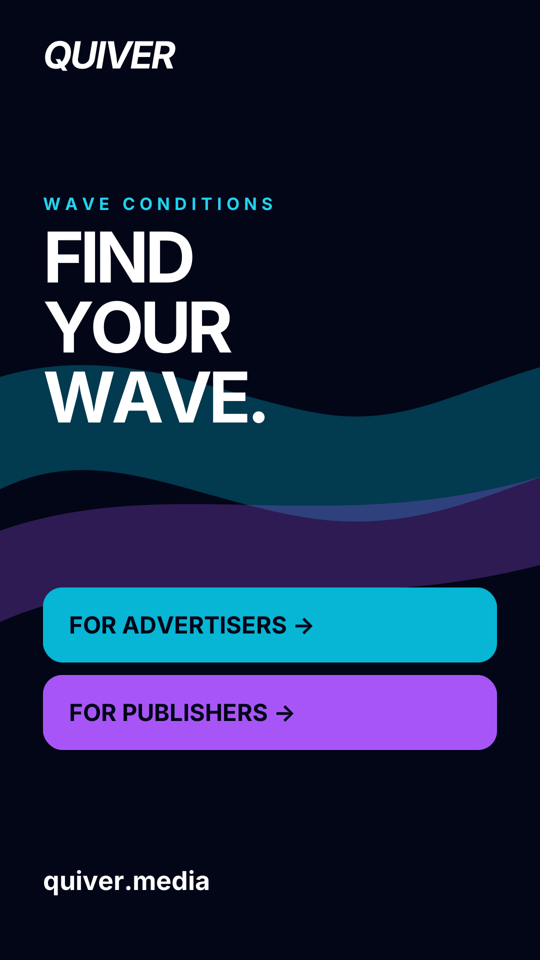
Paired sales decks let each audience follow its own color. A landscape email header and short social sequence introduce a condition, a suitable service, and the next step. Event screens keep the wave idea large and the copy short.
The handoff
Every file, in one place.
17 files, with editable layouts, usage notes and the source inventory.